Enterprise healthcare · 2024 to present
Clarix
Replacing the software five pharmacies run on with a platform built in-house.
- Role
- Research, design, and front-end prototyping
- Team
- 5 designers, a design lead who also PMs, a product manager
- Scope
- Build vs buy evaluation Research, design, prototype
- Status
- Ongoing I joined for discovery onward
Scope. Clarix is a team effort at Clarest Health. I work on research and interaction design under a design lead, alongside a PM, engineering, and pharmacy staff. What follows is my part of it: the discovery research, the synthesis, and a set of design decisions I owned. Screens shown are cleared for sharing; the rest of the platform is not.
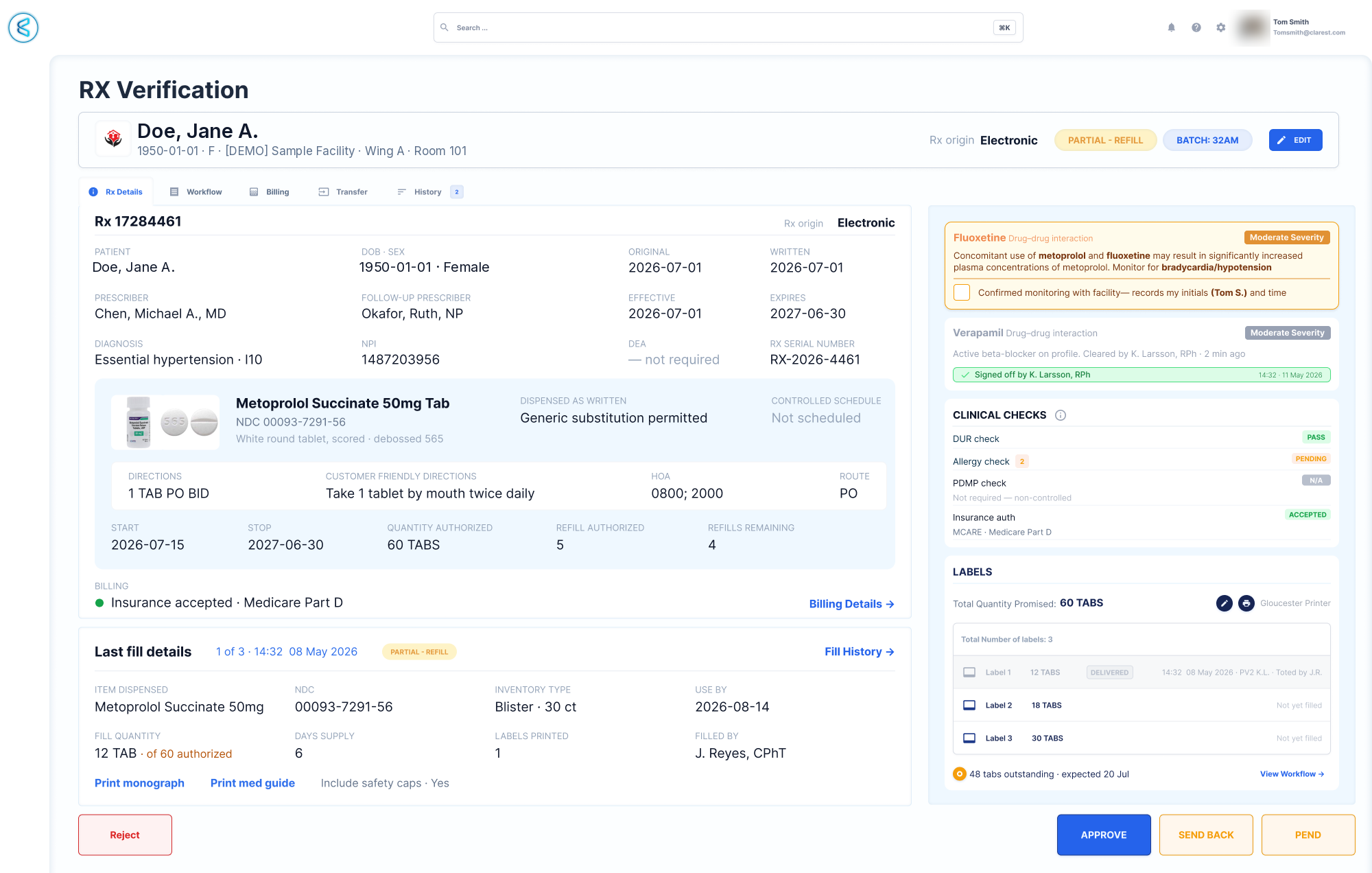
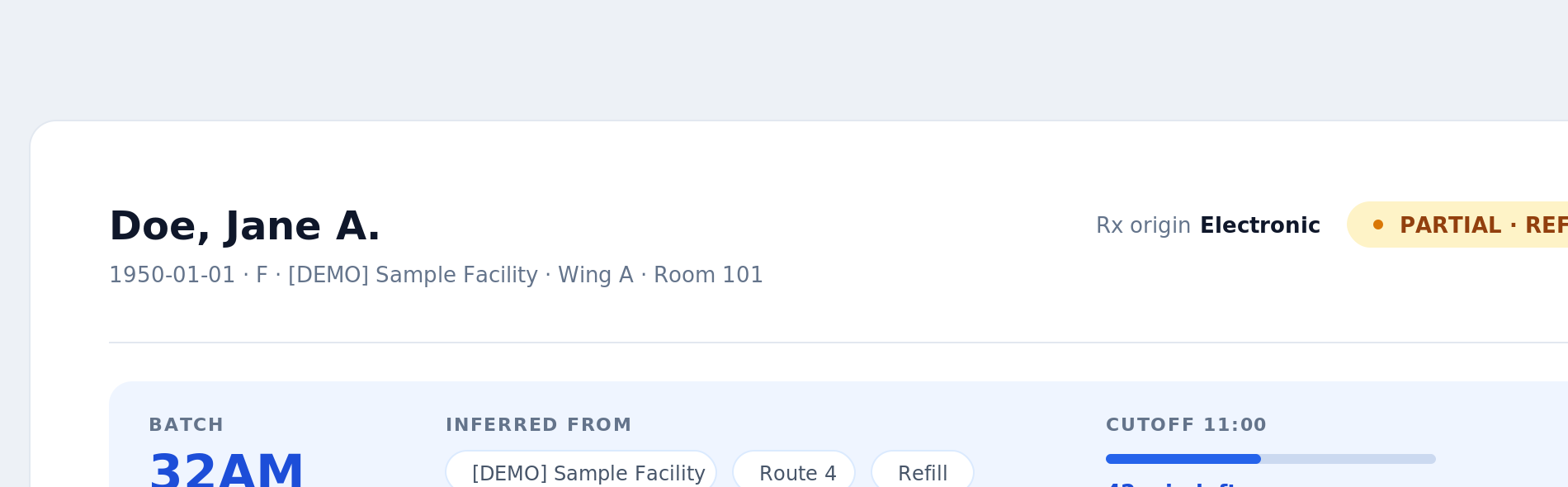
Rx verification in Clarix, mid-fidelity and still in design. Patient, prescriber and facility details are demo data.
The question
Clarest licenses FrameworkLTC across five pharmacies. Is an internally built platform worth the investment, or does the license stay? Nobody could answer that without knowing how the current system is actually used.
What we did
Documented the real process and its friction across 50 participants and four states, then designed against it. On-site observation under HIPAA constraints, a standards audit, and a working React prototype.
Where it landed
The research became both the case for building and the specification for what the new system had to preserve. Development is underway.
Act I
Discovery
A build decision this size cannot be made from a feature comparison. It needed an accurate picture of how the software is actually used, by whom, and at what cost.
Not how to fix it. Whether to keep paying for it.
Clarest Health grows by acquisition. Remedi SeniorCare, ProCare and others now run on one network, and all of them run on FrameworkLTC, a third-party platform with a steep learning curve and a total cost of ownership that keeps climbing.
So the company put a genuine question on the table: continue paying for a system that frustrates the people using it every day, or build an internal platform purpose-built for this network. That is a build versus buy decision, and it cannot be answered from a feature matrix. It needs to know what the current software actually costs in time, errors, and training.
The cost is also not evenly distributed. A pharmacist with ten years in the system has built a vocabulary of shortcuts that makes it feel like second nature, so a replacement reads as a threat to hard-earned fluency. A technician on day one faces a dense, menu-heavy interface with no starting point. Technicians are the highest-turnover role in the building, which means learnability is a recurring cost, not a one-time investment.
The system isn’t broken. It was never built for everyone who has to use it.
Seeing the real workflow
participants across the network
hours of 1-to-1 sessions
findings documented
user roles represented
Where I was
On the pharmacy floor every day.
I am on site at the Massachusetts pharmacy daily, which is the highest performing of the five and the one we centered the study on. I also traveled to the New York location with the pharmacy supervisor, who is separately working on standardizing process across newly acquired pharmacies. Being embedded rather than scheduled is why the workarounds surfaced at all. Nobody performs their sticky notes for a visitor.
How we ran it
Two one-hour sessions per participant, split across the shift.
Mornings captured fulfillment and corrections, the highest-volume work of the day. Afternoons captured order finalization and delivery prep. We used naturalistic observation, directing nothing, and logged every hesitation, every verbalized frustration, and every workaround, including the printed notes and the coworker standing nearby.
The constraint that shaped it
HIPAA and company policy protect live patient data, so no session could be recorded.
We went in person instead, and revisited pain points on screens with patient information removed. That is why this research is observational rather than session-replay based.
12 structured interviews on-site · 6 remote screen-share sessions · 32 network-wide questionnaire responses. Interview participants were excluded from the questionnaire to avoid duplicate data.
Four groups who each need something different

Pharmacists
Years of muscle memory in FrameworkLTC, often across several pharmacies and several versions of it. The most resistant to change, because relearning a mastered system costs real productivity.

Pharmacy Technicians
The highest-turnover role in the building. Many arrive from retail pharmacy with no long-term care experience, and learn the software by asking the person next to them.

Clinical Hub
Remote pharmacists and technicians working alongside our nurses. Several people can edit the same prescription at once, and nothing in the interface signals that anyone else is in it.

Billing and Inventory
A small dedicated team, out of sight of daily fulfillment until inventory counts and back orders, when everything routes through them. The pharmacy director depends on their numbers being right.
Photography is not permitted on the pharmacy floor, so these are stock portraits standing in for the four groups. Everything described is from the research.
The five findings I designed against, and what each one changed
The most-used screen is not the default view
The delivery dashboard needs a multi-step menu path or a manually pinned shortcut. Experienced pharmacists could not recall how to open it without the shortcut.
Urgency signals had gone dead
Wait-time indicators render red regardless of actual urgency. Because some medications are simply slow, red stopped meaning anything and every user group ignored it.
People navigate by memory, not understanding
Asked why they did a step, the consistent answer was “that’s how I was shown.” Printed reminder notes were taped across the pharmacy floor.
Batch management is the highest-friction workflow in the building
One pharmacist spent three hours undoing a single accidental batch merge.
Permissions fail silently
A policy change restricting NDC edits to pharmacists was never reflected in the interface. Users hit dead ends with no explanation and had to find a supervisor.
further findings documented, not shown here
Forty-one findings in total, across inventory, waste and disposal, kit tracking, NDC matching, permissions, and training. The five above are the ones I can show. Others are still in design, or not mine to share yet. This is an ongoing project and findings are still surfacing.
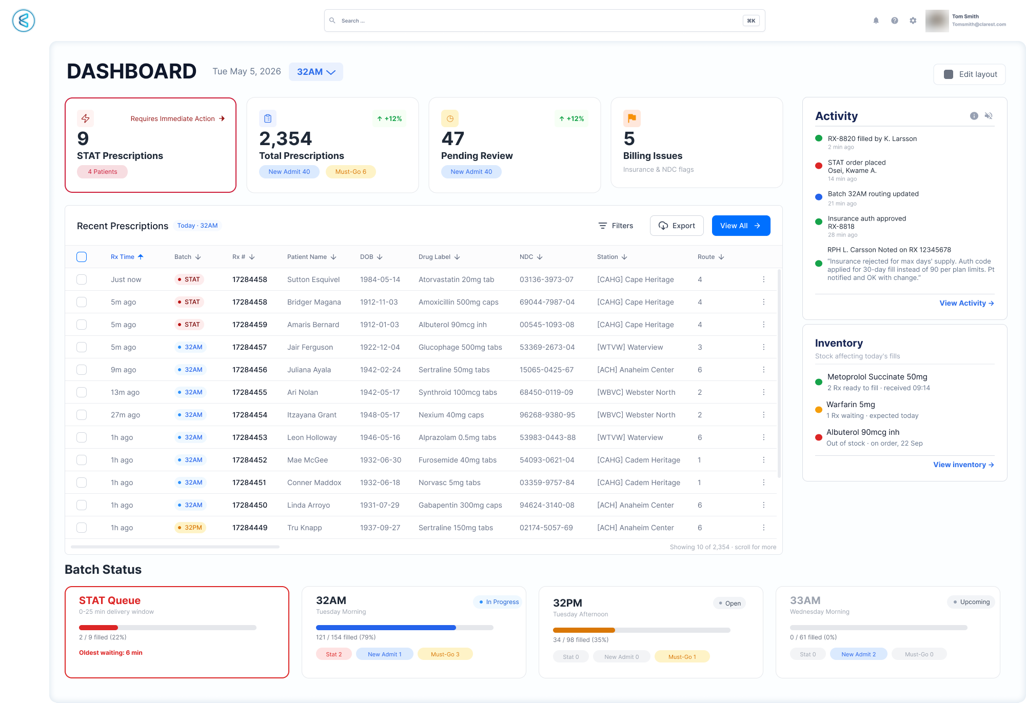
Finding 01 in the design: the screen people could not find is now the landing view. STAT sits first and red, batch fill rates are visible without opening anything, and the day's exceptions are on the same surface as the work. Demo data throughout.
Act II
Design
Findings only matter if they survive contact with a screen. These are three worked examples from my part of the build.
Build something new. Don't make it feel new.
The loudest finding was not a feature gap. It was that the people most affected by a replacement are the ones with the most to lose from it. Pharmacists in long-term care are tenured, frequently across several pharmacies and several versions of this same class of software. Their fluency took years to build and the company paid for every one of them.
That reframed the design problem. A system that is better on paper but unfamiliar in practice does not save money, it spends it, in retraining and in errors during the months it takes people to stop reaching for the old shortcut. So Clarix deliberately models itself on the structure staff already know, and spends its novelty budget only where the research showed the old model actively causing harm.
Kept on purpose
Their vocabulary and their shortcuts
Changed on purpose
Only where it was costing something
Specified, not yet built
The shortcut teaches itself
The modal wasn't slow. It was in the wrong place.
FrameworkLTC makes you pick a batch before the order entry screen will open. The obvious read is that the modal is a speed problem. It isn’t. It’s a sequencing problem.
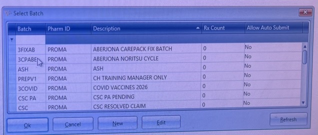
The gate itself. A flat, undifferentiated list: 3FIXAB, 3CPABE, ASH, PREPV1. The columns show Rx Count and Allow Auto Submit, and nothing at all about when a batch closes, which is the one fact the decision actually turns on.
Before · the sticky session
0 misrouted
One click, at the gate
Batch 32AM
Pick a batch before the entry screen opens and every prescription that follows inherits it. The error happens upstream of all the work, so one wrong click at the start is twenty wrong records by the end of the session.
After · inferred per record
no shared upstream decision
Batch becomes an attribute of the prescription rather than a prerequisite for entering one. Each record infers its own from facility, delivery route, prescription type, and time of day, and shows that reasoning on screen so a wrong one is visible at the moment it happens.
The decision
Batch is an attribute, not a prerequisite
What makes it safe
The reasoning is the feature, not the default
Seven cases force an explicit choice instead of inferring: STAT · new admit · multiple routes for one facility · past cutoff · prior auth pending · controlled substances · batch at capacity.
Designing an undo for an action that never had one
prescriptions movable in one unfiltered click
to recover from a single accidental merge
steps per prescription to put it back
The Move button relocates selected prescriptions between batches. If a user forgets to filter first, the selection can be every script in the week. There is no undo. Recovery means opening each prescription, identifying its origin batch, and moving it back by hand.
This is a case where the interaction cost of the fix is trivially small and the cost of not fixing it is measured in hours of pharmacist time on a floor moving 5,000 scripts a day.
The safety layer
Filter confirmation. Shows exactly how many scripts are selected and which filter is active before anything proceeds.
Destination selection. A simplified today-only list rather than the full undifferentiated batch table.
Final confirmation. “Move 47 prescriptions? From 32AM to 32PM, Tuesday afternoon run, closes 18:30.” The count is stated three times and broken down by wing.
Reversal window. A persistent toast with a countdown and a single Undo button, live for fifteen minutes.
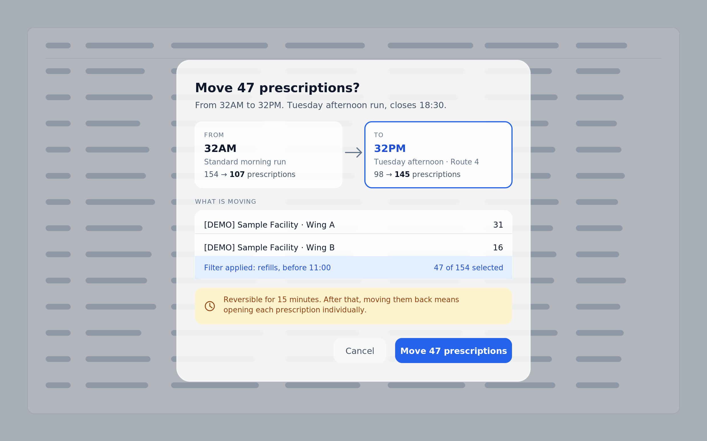
The count appears three times, and the breakdown by wing is there so a technician who meant to move one wing sees the sixteen scripts they did not intend to touch. 47 of 154 is the line that stops someone who forgot to filter.
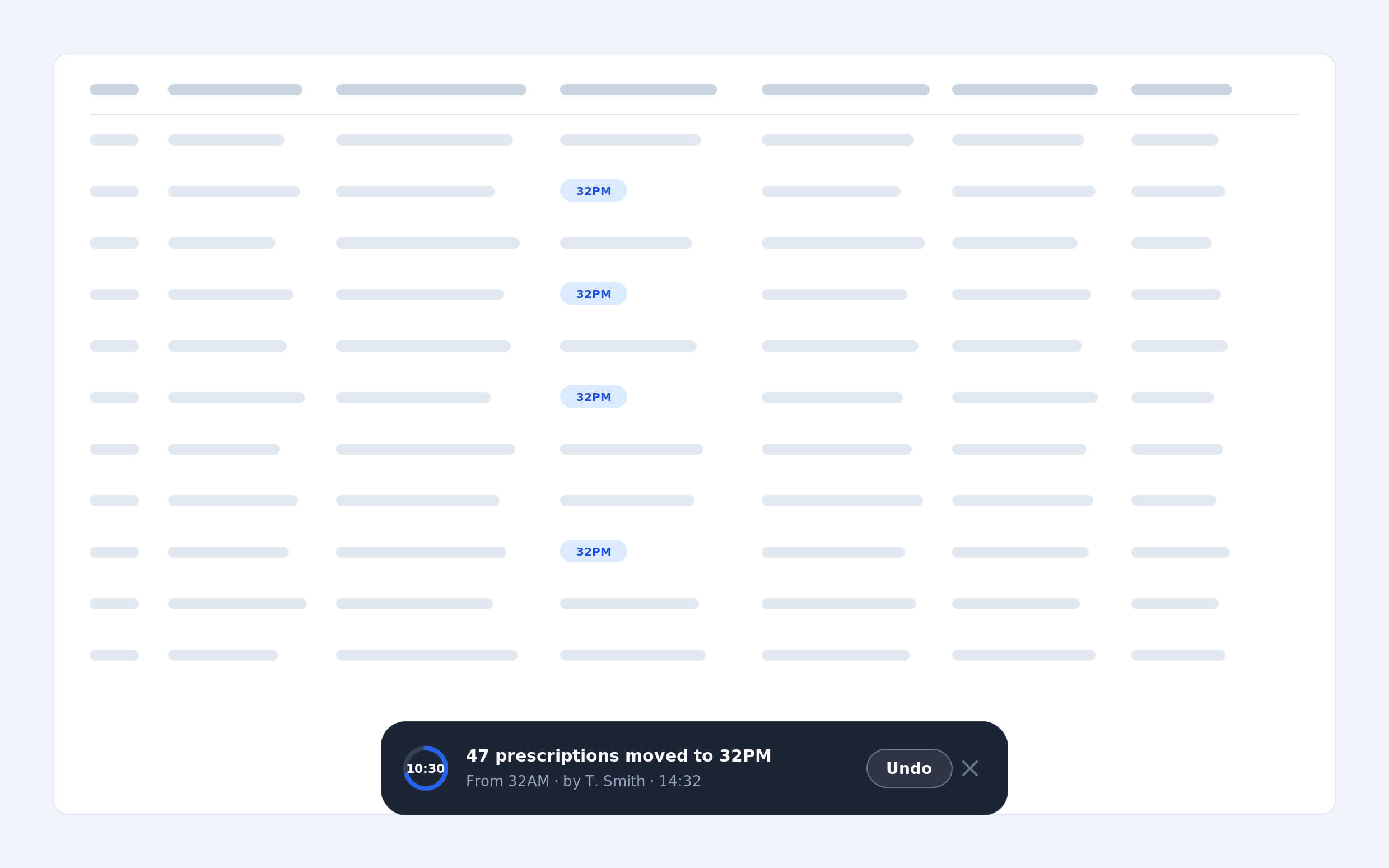
After the move, a persistent bar holds the countdown, names who moved what, and keeps Undo one click away. The window is visible rather than promised, and nothing underneath it is blocked.
The screen that didn't know what it was
I made an early call to have one screen serve both new prescription entry and read-only viewing. State would handle the difference.
The result had an Edit button, which implies the record is immutable. It had dropdowns, checkboxes and a batch selector, which imply it is editable. It had a Submit button, which implies you are creating something. Every individual control felt subtly misplaced, and I spent real time adjusting spacing to fix a problem that was not a spacing problem.
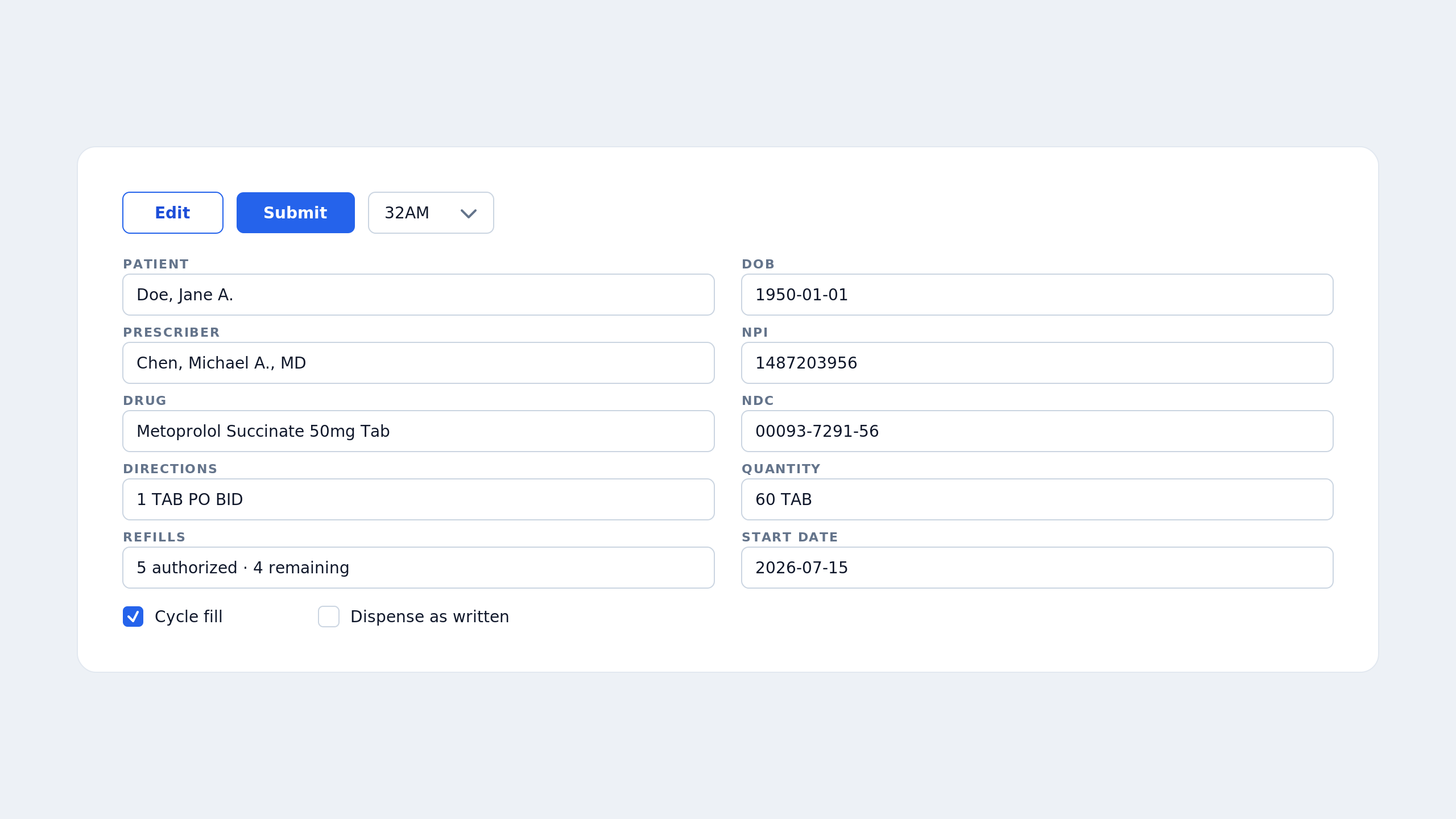
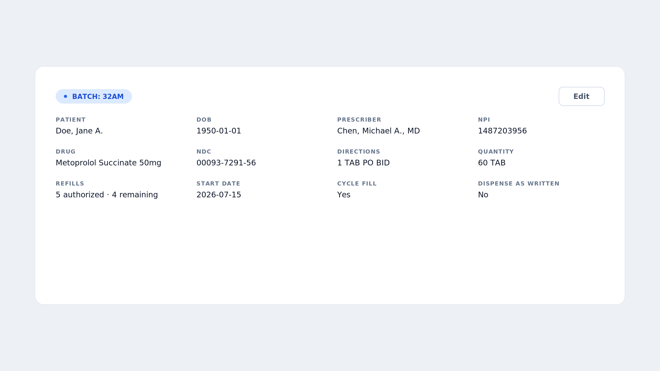
Before: every control contradicted another. No amount of spacing would have fixed it, because the problem was conceptual.
After: two renderings, same information architecture. Cycle fill becomes a value instead of a control, which dissolved the awkward-checkbox problem rather than solving it.
The tell
A competitor audit, not a critique session
Auditing the design against the standards it has to survive
Before high fidelity, I audited the prescription record against NCPDP SCRIPT, NCPDP Telecommunication D.0, and HL7 FHIR. The headline: the screen modeled dispensing well and origination not at all.
No prescriber appeared anywhere. No name, no NPI, no DEA number. A prescription without an identified prescriber is not a prescription. That was the largest single gap and it would have shipped.
Missing prescriber identity, NPI, DEA
Missing refills, written date, DAW code
Payer identity incomplete: BIN present, PCN, Group and Cardholder ID absent
No claim rejection state, pricing could only express success
PDMP absent, despite already existing in the pharmacy workflow
“Route” used for delivery route, colliding with route of administration in every clinical standard
And then
I chose not to add most of them.
10 · The screens
What it became
01 / 03
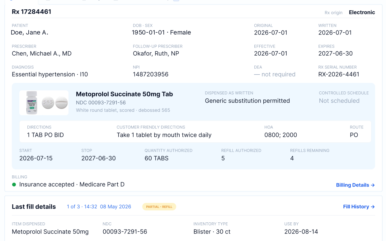
The prescription record
Everything a pharmacist verifies against, on one screen, with no scrolling on the pharmacy’s dual-monitor setup.
02 / 03
Inferred batch routing
No modal. The batch is inferred from facility, delivery route, prescription type and time of day, and the block shows the evidence it used. A default that explains itself is self-correcting.
03 / 03
Move, with a way back
Three confirmations and a fifteen-minute undo window on the action that previously had none. The dialog’s job is disclosure, not a second guess: it states what is moving, and from where.
Where it stands
Clarix is in active development. Rather than claim outcomes the platform hasn’t produced yet, here is what is decided and built against, and how we instrumented it so the impact is measurable rather than asserted.
Decided and in build
- Batch gate removed from Clinical Hub order entry, replaced by inferred routing with visible reasoning
- Three-step confirmation and fifteen-minute undo window on all batch moves
- Batch selector regrouped into Today, Upcoming, and Special or Archived
- Must-Go and New Admission converted from separate batches to system-applied tags
- Read-only and entry renderings separated
- Existing keyboard shortcuts preserved, with an in-context prompt that teaches them
How we’ll know it worked
Every batch assignment records whether it was inferred and accepted, overridden, or later reassigned. That gives us a tuning signal for the inference rules and a real before-and-after on misrouting rate.
Secondary measures in the usability test plan: time to first correct order entry for a new technician, accidental merge frequency, and unassisted task completion on the delivery dashboard.
The domain knowledge was the design work
When I first raised redesigning batch management, the pharmacists pushed back. It works in theory but not in application, they said, and one added that it would seem like a lot of work for us to design and build. I told them that figuring out the hard things is the job. That conversation set the tone for everything after it, because it made clear that credibility with these users would come from understanding their work, not from showing them nicer screens.
None of what made this design possible is discoverable from a screenshot. Blister packs hold 30 units, but cold seal blisters hold 31. A short label is label 1 of x, so the remainder comes first. A partial fill is a judgment call, not a rule: nine homes, seven residents on one drug, thirty tablets left, and it’s Friday with no delivery until Monday.
The interviews are what made the design possible. The screens were the easy part.